Typography
Our typographic system is based on simple rules that prioritise legibility. It's clear. It's bold. It gives opportunities to be very expressive.
Fonts
We use three fonts for the design of digital and print products.

Barlow
We use Barlow as our main font for print and interface design. It is used for both long-form text and headings.
Barlow Condensed
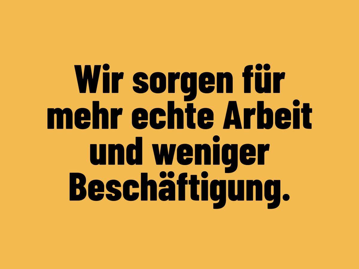
We use Barlow Condensed as a display font. Use it for short and sweet headlines, usually to celebrate or promote something.

Franziska Pro
Fransika Pro is used for text and quotes that should stand out.
Text styles
We use a predefined selection of text styles for our digital products. These design tokens can also be used for print design.
Display text
Use for titles, lead-ins, or at the beginning of a larger section. Use sparingly and only for short texts!
Barlow Condensed ExtraBold
Condensed line spacing (0.9x – 1.1x)
Headlines
Headings give structure to the design and allow us to visually distinguish sections from one another.

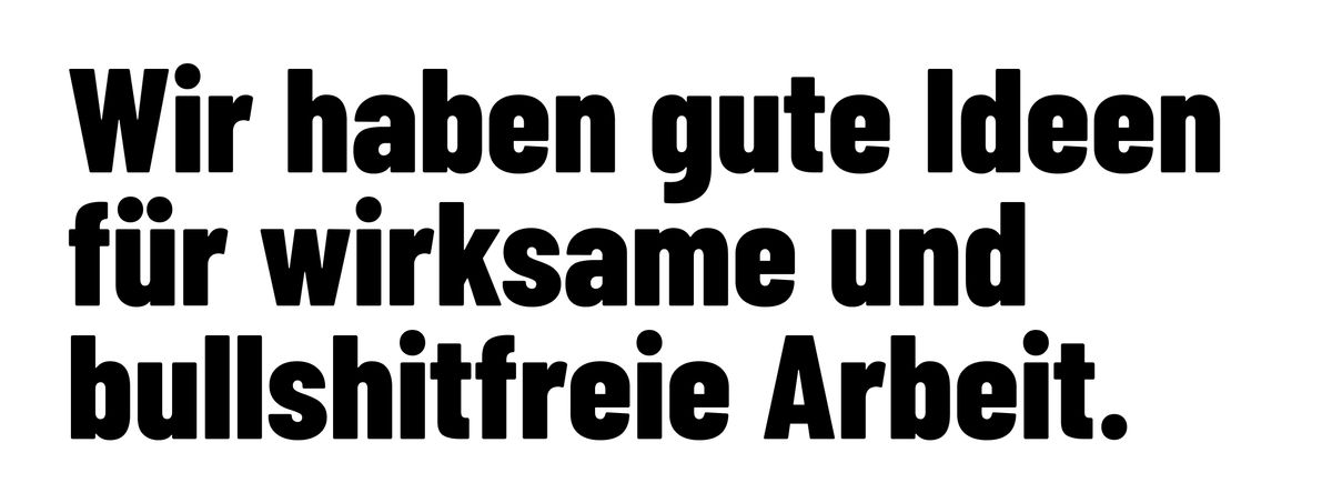
Barlow Bold
Scale font size according to hierarchy
Set with low line spacing (1.1x – 1.2x)
Longform body text
Barlow is our standard font. Unless you want to be particularly expressive, you should use Barlow. To increase the contrast of the font, use Barlow Medium for body text.
You should always align text in Barlow to the left or center it. Keep the line length between 50 and 60 characters.
Italics or bold text can be used to highlight text passages. Avoid double formatting (bold and italics), and don’t mix up different treatments too close together.

Barlow Medium
Line spacing from 1.4x
Quotes
Franzika Pro should only be used for complete paragraphs of text and should not be mixed with other fonts within a paragraph.
Since we use Franzika Pro to highlight quotations, we consistently use italic lettering.

Franziska Pro italic
Line spacing approximately 1.4x
Do not set too small