Skip to content
Design System
  • Documentation
  • Prototypes
Branding
  • Logo
  • Colors
  • Typography
  • Illustration
  • Social media
Foundations
  • Usage
  • Global styles
  • Themes
  • Spacing
  • Viewports
  • Colors
  • Typography
  • Core utilities
Layouts
  • Usage
  • Aspect ratio
  • Auto grid
  • Content grid
  • Flex group
  • Flow
  • Multicol
  • Pile
  • Reel
  • Region
  • Repel
  • Sidebar
  • Switcher
  • Wrapper
Patterns
  • Accordion
  • Avatar
  • Avatar Group
  • Book pile
  • Brand shapes
  • Button
  • Calendar Date
  • Callout
  • Card
  • Context Switcher
  • Figure
  • Forms
  • Hero
  • Icon
  • Icon link
  • Image Bento
  • Image Grid
  • List Icon
  • Marquee
  • Modal
  • More Link
  • Pagination
  • Pill
  • Promo Card
  • Prose
  • Section Divider
  • Section Heading
  • Section Illustration
  • Show More
  • Slideout
  • Submenu bar
  • Table
  • Tabs

Social media

We are very sociable and always present ourselves from our best side.

Our social media posts are based on the brand guidelines, especially the use of color and typography.

Examples #

Text example set in the font Franziska Pro

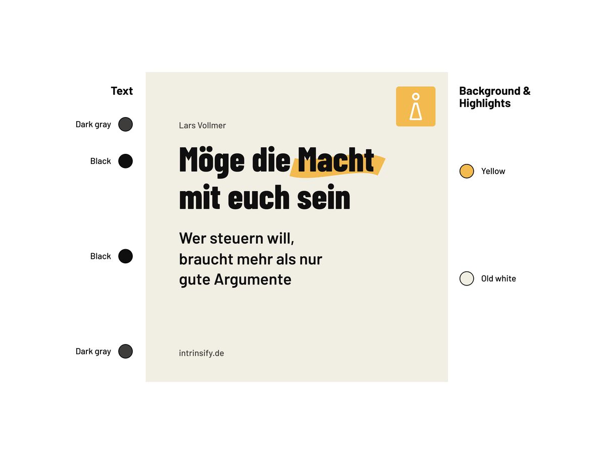
Old white can be used to tint the background. Use yellow to highlight text or illustrations. Use dark grey to tone down secondary text.

Text example set in the font Franziska Pro

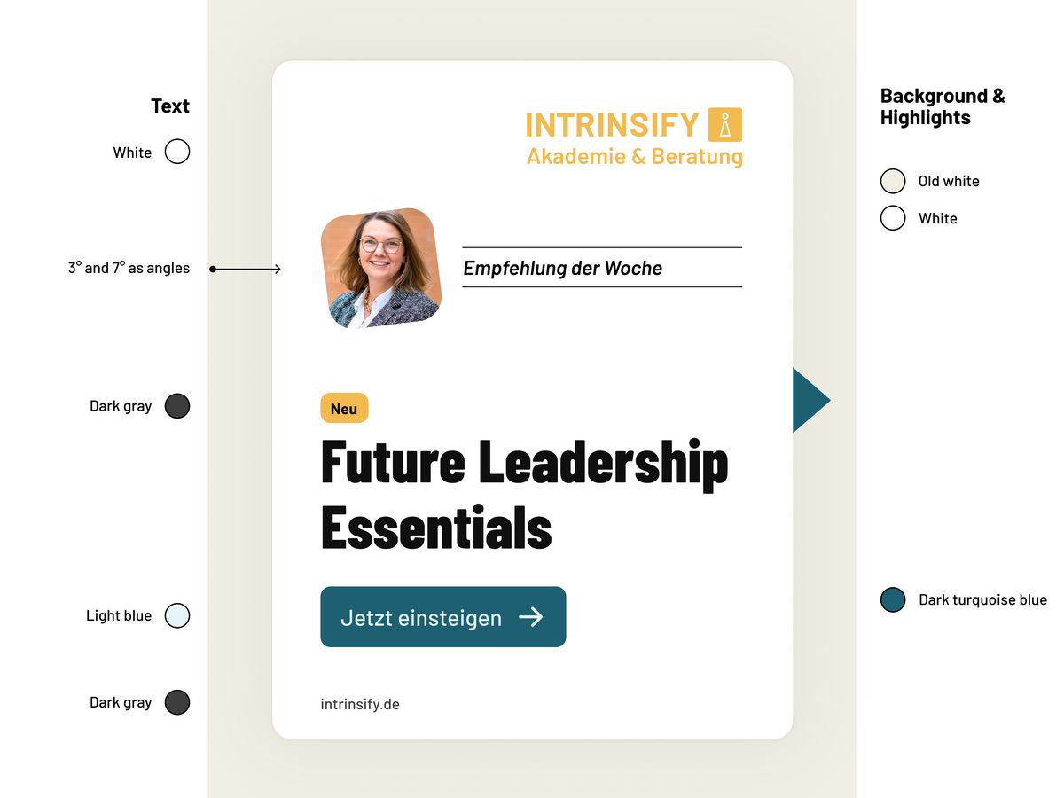
Rotate the image wrappers at angles of 3° or 7°. Use yellow for highlights, such as the word ‘new’, and turquoise blue for interactive elements or guidance.

Text example set in the font Franziska Pro

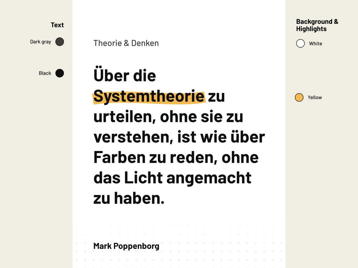
Try using a white background for a different look. You can also use patterned backgrounds to add more detail to the design.

Theme